I just had to play along in the Inspiration Challenge this week at Splitcoaststampers. Everyone was to get their inspiration from one of the many Lang Calendars available. Oh my there were some beautiful calendars. I so enjoyed just browsing through them. I may have to return to their site again only this time with my VISA!! lol I made a couple of cards using Stampin’ Up! products only. I used a page from the “Vintage Design” calendar found here for my inspiration.
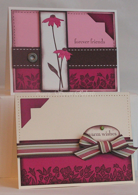
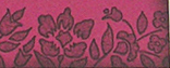
On the bottom card only, I used my marker and outlined the floral border. It defined the image, but took away some of the softness. I couldn’t decide which look I liked best, so there’s one of each! Do you have a preference?

Have a wonderful weekend. Happy stamping!
——————————
All products are Stampin’ Up!
Stamps: Inspired by Nature, Beautiful Borders
Papers: Whisper White, Chocolate Chip, Rose Red, Pretty In Pink
Inks: Chocolate Chip, Rose Red, Marker
Accessories: Chocolate Chip Stitched GG Ribbon, Ribbon Originals Alpine Ribbon, Antique Brass Jumbo Eyelet, Always Artichoke Brad, Oval Punch, Photo Corners Punch, Piercing Tool and Template


Pretty cards. Love the great colors. I love the outlined images. :o) TFS!
Susan, your cards are lovely. The unoutlined border looks good on the card with the flowers as it doesn’t take away from the flowers. The outlined border card looks good on the other card because it pulls the eye there softly but it’s not competing with an image. So, they’re both great the way you did them. I love Lang calendars and have two of them currently. If I had time I’d love to play.
Both cards are gorgeous as well as both borders. I think the borders work perfectly with the respective design. The outlined border has a more modern feel and the top border is more vintage or classic.
Thanks for sharing both. Love them both and would use each depending on the design.
Nope! No preference here! I think both cards look lovely as they are! That’s a great stamp to begin with and the ribbon is just yummy! Great cards, TFS!
Wonderful cards and great color…fuschia . Like the outline, but that’s just my opinion. Your cards are always awesome. Pat
Beautiful. I like both looks, and I can’t make a choice. The warm colours and sponging are perfect here.
Absolutely lovely cards, Susan, both of them. I think each version of the border suits the cards they are on. The ribbon on each of the cards is perfect too! Fabulous!
These are both stunning! I love that pink with the brown!
I like them both. The softer look definitely looks better when pairing with another image and the “more defined” look is better with the saying like you have them. I’ll have to try this sometime.
These are both beautiful, Susan….I love all the colors, images, piercing, embellies…everything little detail is amazing!!!
Hi Susan, your card is gorgeous (aren’t they all though?!). I really like the outlined version. You smartie pants!
Very beautiful cards! I love the colors!
The outlined flowers give more deeps to the card! It looks that they were embossed!
Pretty Susan, great colors. I like the layout as well.
Both are so very beautiful, Susan!! I love the colors and pretty images!! Wonderful!!
I like the way you have them on each card. On the bottom card, the outlining helps draw your eye down the card and looks great since there isn’t anything competing for attention. Looks great!
thank you for your visit to my blog it make’s me very happy because you know i love your work
Wow! These are just gorgeous. I think I like the one that’s outlined, but not enough to actually do it… LOL
Gosh Susan, those colors are to die for!!! I love how you took the pen and made one a little different – adds a different pizazz!
Both cards are gorgeous, and the colors beautiful! I like both borders, they go great with their respective card…outlined with the striped ribbon, and not outlined to go with the softness of the flower image.
Wow!! These are beautiful, I love them both~ great colors. Thanks for sharing. ~Blessings. Renee
Love the effect of outlining that border, it’s so simple but gives a great finish.