Got some new SU toys! Here is a card made with the “Flower Fest” set.
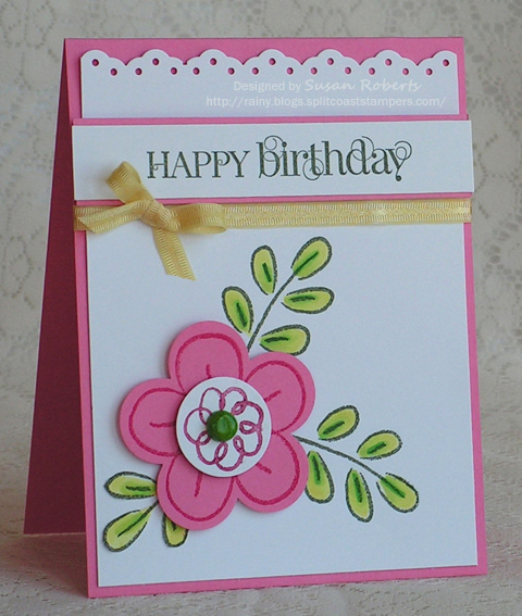
SO much fun! The flower center’s brad was colored with the darkest Copic used on the leaves. Makes for a pretty good match!
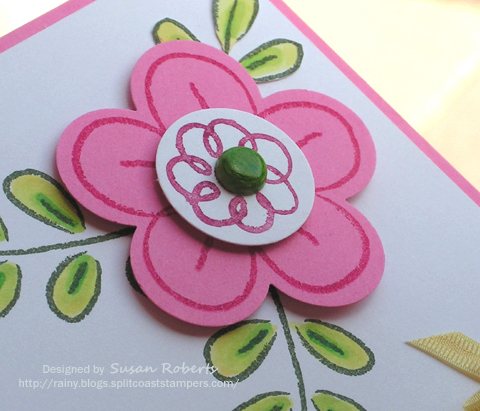
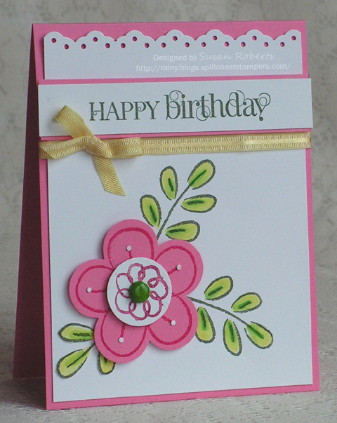
Over the past few months I have been trying to simplify my designs to a more clean and simple style. Must say it has been a difficult journey. I continually look at a “finished” card and feel like something more just has to be added. The punched eyelet border on this card left some little tiny white circles. I took some of them and glued them to the flower lines. It really muddied up and distracted from the simple sweetness of the card. Dang. Too late to take them off as the glue really stuck and removing them would leave marks on the pink card stock. (I tried.) Double dang! LOL
Sigh. When will I learn?!? But whatever. I’ve got more new toys to play with, so life is good! ![]()
Happy Crafting!!
——————————
Stamps: Stampin Up Flower Fest and Curly Cute
Papers: Papertrey Ink Select White; Stampin Up Regal Rose
Inks: Stampin Up Always Artichoke and Rose Red; Copics:
![]()
![]()
![]()
![]()
![]()
Accessories: Stampin Up Fancy Flower Punch, Eyelet Border Punch and 1″ Circle Punch; Making Memories Ribbon; Brad


Ha! I am always thinking I need to add a “little something else” to my cards…but my style is really pretty CAS. Although it is fun to get carried away sometimes, the cards that make me catch my breath the most are almost always simple…those are hard to make! This is a lovely card and not fussy at all! Love how you added the ribbon nudged right up to the sentiment like that!
Susan this card is right up my alley! I love the bright colors and the white space. I’m glad you’re using some SU stuff again. TFS.
Wow, Susan, this is a beauty. Love the crisp, clean look and your colors are fabulous.
Really pretty and I like the little white dots! Clever.
I too am more pleased when I create a C&S card, but I still get into my layering and adding just a tad bit more mode as well! This is cute with those little white dots – I like them!
This card is a perfect example of layered CAS. I love the fresh fun look of pink, white and green.
CAS should be easy but it’s not! I love your take on the style. Maybe you should call it CAS+!
That is frustrating when you’re just sure it needs something…and then you wish you hadn’t done it.
I like the card tho! happy and fun!
Rainy..less is more as they say and I love this C&S card. Great color combo and just a perfectly sweet and simple card. Pat
so cute, I too have trouble with stopping myself from putting too much on a card. Love the font style on the sentiment!
BEAUTIFUL Susan!!~
Love the fresh clean look, Susan! That pink really pops your design.
I love how cute and sweet and simple this is! The style really appeals to me, and any single solid color with white is my current favorite. This is just like candy to me!