Had some fun new stamps and some fun new papers. What else could I do but make a couple of fun new cards?!
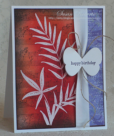
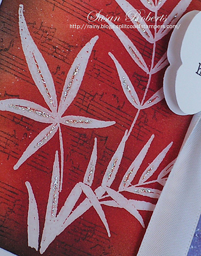
Although I changed it up, I got the idea for this design at my local craft store. They had made a card using this stamp. I was totally sold and bought the stamp right up! lol Using the embossed resist technique, the image was clear embossed. Inks were sponged on, and the musical image was then stamped. Because of the clear embossing, any ink from the musical backgrounder was easy to wipe off from the leafy image. Stickles was applied over the clear embossing.
There was lots of sponging and inky fingers with the creation of this cowboy riding off into the sunset, too.

With all the beautiful designer papers now, it seems like it’s been awhile since I have created this “style” of card by making my own backgrounds and scenes. Had such fun getting inky!

——————————
Card 1:
Stamps: Penny Black “Breezy”; SU Teeny Tiny Wishes; CHF(?) Musical Backgrounder
Papers: PTI Select White; Memory Box “Viola” Designer Paper
Inks: Memento Tuxedo Black; VersaMark; SU Pumpkin Pie, Really Rust, Ruby Red and Elegant Eggplant
Accessories: Hero Arts Clear Embossing Powder; Stickles “Silver”; SU Butterfly Punch, Linen Thread and Satin Ribbon
Card 2:
Stamps: Waltzing Mouse Stamps “Way Out West” and “Back in the Saddle”
Papers: PTI Vintage Cream, Terracotta Tile and True Black; My Mind’s Eye “Fiddlesticks” Designer Paper
Inks: Memento Tuxedo Black; SU Almost Amethyst, Lavender Lace, Taken With Teal, Really Rust, Pumpkin Pie, More Mustard and Summer Sun; Copic![]()
Accessories: GG Ribbon; Corduroy Button; Nestabilities Classic Circles Dies


Gorgeous dramatic cards, Susan! Love the stickles addition. New stamps should never gather dust!
Beautiful split colour panels on both cards but particularly dramatic on the first one. I am going to have to try this soon.
What a beautiful card! I just love everything from the red colors to the way you tied the butterfly to the ribbon, up to the sparkle!!.
Also the horse card is great as a male card!
Loving the first card and can see why you snapped the stamp up. The butterfly on the ribbon is fabulous. Great western themed card too! You rocked them both 🙂
Very nice cards, I really love the first one! I love using embossing as a resist! Turned out gorgeous and the little bit of Stickles really makes it pop!
Gotta love new product. Wonderful cards, I love the reds and purples on the first card. I am also jealous that you have local stores. All of the wonderful stores we had are gone.
Beautiful cards, Susan. I love getting inky and stamp resist is one of my favorite techniques!
I absolutely love both of these cards!!!
Susan…Love both cards…so unique yet both so beautiful. You never cease to amaze!
Both cards are beautiful Susan! Your stamping is the best!!
That is an *excellent sunset!! Looks like he’s riding thru the AZ mtns! 🙂 And the first card is so bold and fun! I love the music stamp!!
Oh Wow, Gorgeous stamping , love your colors, that sunset is so pretty on the second card, wonderful masculine card!
Beautiful! The color designs are awesome.
Awesome!! I love both of these Susan! What a way to get inky.
OH my, the first card is dramatic in it’s beauty! WOW! I love how you created that one! The masculine card is perfection in the colors and sunset and I love the papers too!
Love, Love, Love the first card. Hope to try it out soon. The cowboy card is super too Susan. You always do such a nice job.
You asked on my blog if I was related to a Carol Ann. Nope, don’t have any sisters only a couple of cousins and they don’t look at all like me. Someone the other day told me I look just like someone else they know, guess I just have “one of those faces” lol. Thanks for stopping by my blog!
Love your cards . Really a beauty with the background on #1 and I guess my question on card #2 is….are you sending that cowboy my way??? Awesome work. Pat
Susan I ADORE your work!!~
Love Love LOOOOOVE the look of the little bits of sparkle on the leaves on the first card. Great color combo, too….love that soft red and blue together.
The second one is just totally COOL…great western card all around!
Wow! That first card is amazing! Love how you made it look like the most fabulous designer paper. And the second is just as gorgeous in a manly kind of way. Riding off into the sunset…it would make an ideal retirement card.