May 272008

It’s almost June and time for weddings.  I’ve made several wedding cards this year and wanted to show a few that I made last summer as well.

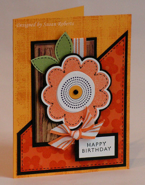
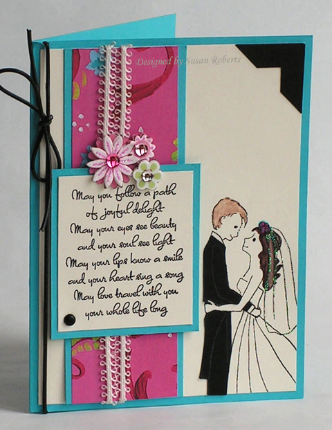
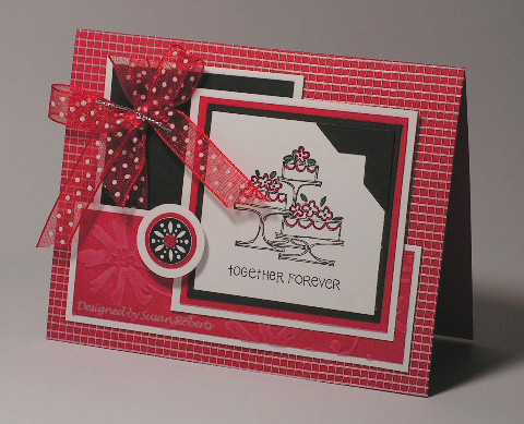
As I’ve mentioned before, I like to take the invitation and use it to be inspired for making the wedding card.  On this first card I used the actual ribbon from the invitation.  The invitation itself was red, white and black, too.

blog59lookingback2awithwm.jpg

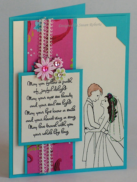
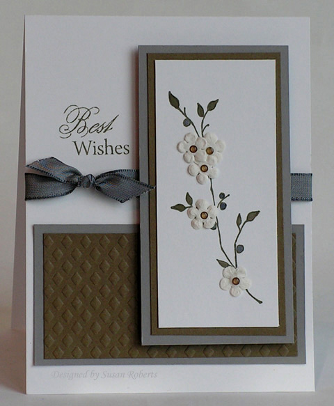
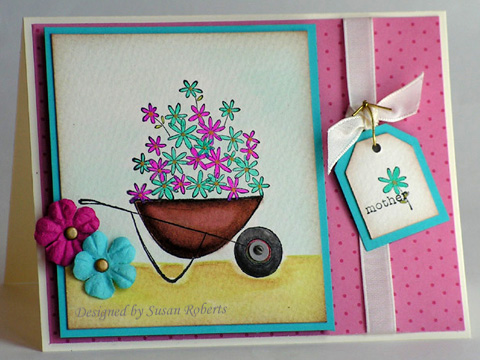
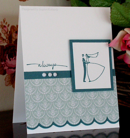
The invitation which inspired this next card was a very clean and simple one with some blue accents.

blog59lookingback2bwithwm.jpg

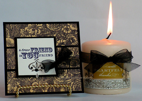
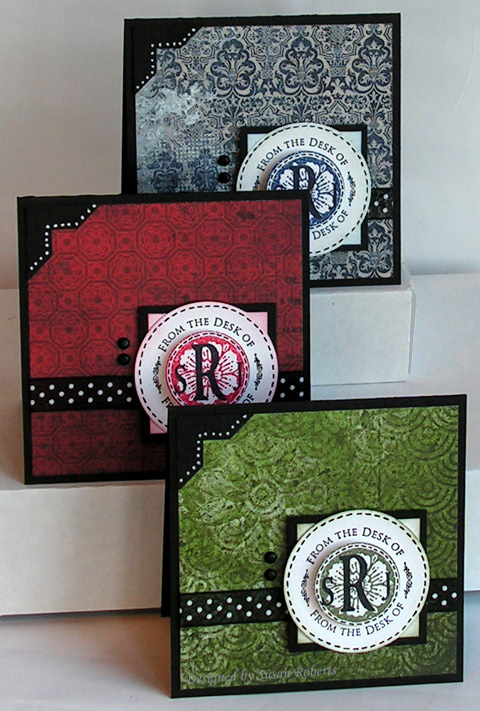
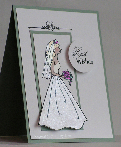
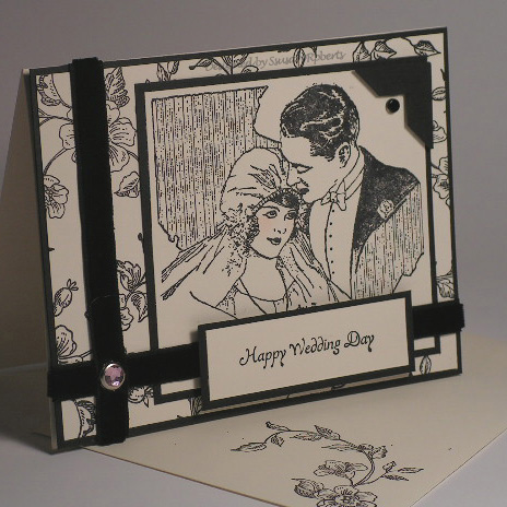
Can you guess what the invitation looked like for this next card?  Well if you guessed black and white and traditional, you are right.

blog59lookingback2cwithwm.jpg

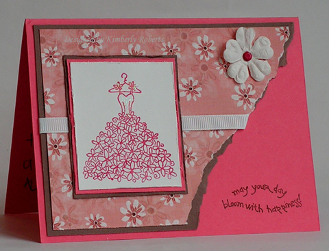
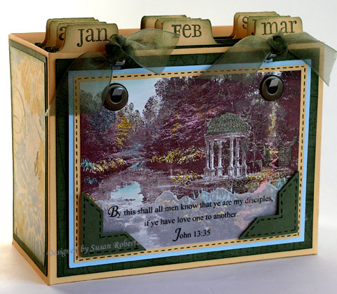
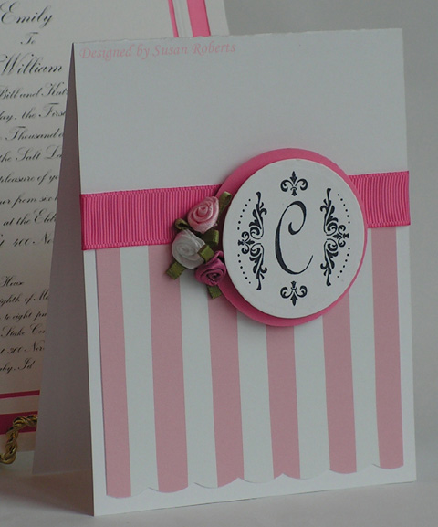
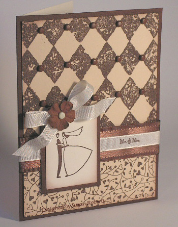
On this final card I used the paper insert from the invitation as the main card stock for the backgrounds.  The Wild Hearts backgrounder was almost a perfect match to the border around the text on the invitation.

blog59lookingback2dwithwm.jpg

So the next time you get an invitation, give this a try.  Let the invitation inspire the direction or design or colors of your card.  Or actually incorporate parts of the invitation itself.  It’s really fun!

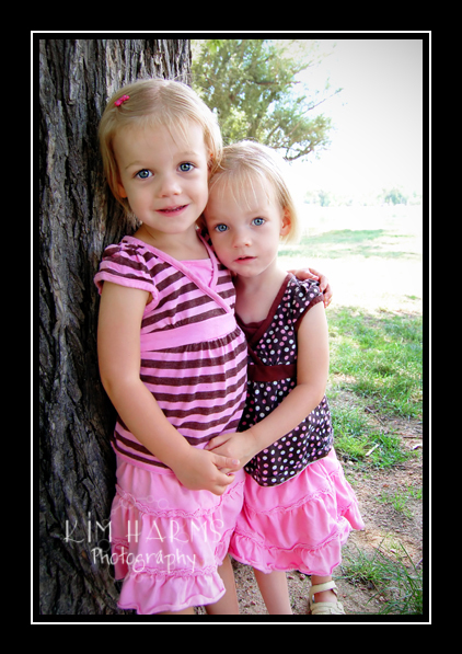
**I’m still out of town visiting my sons and their families and haven’t had as much time to blog as I originally thought I might.  My little 3 year old granddaughter had her tonsils out on Friday and unfortunately developed pneumonia.  She ended up having to stay in the hospital over most of the holiday weekend.  She is home now and doing much better.**

Hope everyone has a happy and healthy Tuesday!

Any respectable grandma shows off pictures of her adorable grandchildren… right? Here are mine… my beautiful twin granddaughters at age 3. If you live in the Colorado Springs, Colorado area you may want to look up Kim Harms if you need a photographer. I love this picture of the girls.

blogbeautifulgirls.jpg

Here are a couple of shadow boxes I did for the Fan Club at Splitcoaststampers when I was on the Dirty Dozen Design Team.

I titled it: “Grandma’s Garden”.
bloglv3dd.jpg
(Click on it to enlarge.)

Today I am on a plane to go see my sweet girls. One of them is having her tonsils out tomorrow. Since she will not be able to go to her daycare for a couple of weeks, grandma will be taking care of her so that her dad (my son) won’t miss any school and her mom won’t have to take vacation to care for her. The last time I saw them was at Christmas. I’m sure that they will have grown considerably since then.

I don’t expect to be making any new cards or projects to show you until I get back home, but I do have some cards that I have made over the past couple of years to share with you. Most of these have been uploaded in some gallery or another on Splitcoaststampers. A few have not. I got this idea from Sharon Johnson. She will sometimes post some of her older cards and I just love seeing them. So I hope you enjoy “Looking Back” with me.

Let’s start with this card. It could almost pass as a card inspired by the photo of the twins at the top of this post! What do you think?

2bloglv28withwm.jpg

This was made with some of the first designer paper I bought. I remember being so intimidated by dp. I was much more comfortable using my background stamps. Now I have notebooks full of dp and have to remind myself about that stack of backgrounders! How times change!

Stamps: Long-Stemmed, Sentiment (?)
Paper: Close to Cocoa, Brushed Gold, Very Vanilla, Blush Blossom, DP K&Co.
Ink: Chocolate Chip, Certainly Celery, Apricot Appeal , Blush Blossom, Regal Rose
Accessories: Prima, Brad, GG Ribbon

Take a look at this inspiration piece! Oh Beate, this was a fun one!

copy-of-blog57bic14-anthropologielatefordinner.jpg

There was so much to choose from, but I settled on the orange, yellow and green color combination. And I couldn’t get my mind off of that big ole flower at center stage, either.

blog57beateic14withwm.jpg

So that became my main focus. For the wood grain panel I used an embossing plate from Spellbinders on some striped dp. After the grain was embossed I ran my Close to Cocoa ink pad over it. I love how it turned out even if I ended up covering most of it with the flower.

How does Beate’s inspiration piece inspire you?

Stamps: Ginormous Flowers, Seeing Spots, Older & Wiser, Flannel Plaid (All stamps are from Stampin’ Up!.)
Papers: Summer Sun, Pumpkin Pie, Certainly Celery, Basic Black, Whisper White, DP from My Mind’s Eye
Inks: Summer Sun, Pumpkin Pie, Certainly Celery, Close to Cocoa, Jet Black Stazon
Accessories: GG Ribbon, Brad, Gel Pen, Cuttlebug, Spellbinders Embossing Plate, Circle Punches

Each Saturday brings a new inspiration piece at Splitcoaststampers. This week our inspiration is to come from this En Fleur Candle.

blog56scsic128piece.jpg

Here is what I was inspired to make.

blog56scsic128withwm.jpg

Those are “Rub-Ons” from American Traditional Designs on the candle and below the sentiment on the card. After transferring the rub-ons to the candle, I used my heat gun to slightly warm the wax. It seemed to set them into the wax quite well so that hopefully they won’t become “rub-offs”!

If you think you would like to play along in the challenges at Splitcoaststampers, you can find them listed on their homepage here in the right hand column under “Weekly Challenges”. But beware… it is VERY addicting! lol

Stamps: True Friend, Floral Backgrounder
Papers: Basic Black, So Saffron, Very Vanilla
Inks: Basic Black
Accessories: Candle, Rub-Ons, Organdy Ribbon, Brad

I have heard this happens.. but it had never happened to me.. until the last few days. Maybe it is all the wedding themed cards I’ve been needing to make? Well after 3 days of sitting and staring at my stamping table, I decided I needed to do something. So here it is.

blog55withwm.jpg
Gosh I’m really not happy with it but have no idea what to change. I love all the elements I used.. the sweet Wedding Party image from Flourishes, the wonderful sentiment from Crafty Secrets Clear Art Stamps that I bought at Eclectic Paperie. And I love these sparkly chipboard flower stickers. I again tried to personalize the card by using the colors from the invitation itself. And I even colored the bride and groom’s hair the color of the real bride and groom’s hair based on their picture inside the invitation.

Oh well, I’ve heard that when this happens, when the mojo takes a vacation, the best thing to do is take a break and then just stamp.. just stamp anything for fun.

I love Friday’s. I think it is my favorite day of the week. Maybe I can talk DH into going to see Ironman tonight. Seems like it’s been so long since I’ve been to a movie. I’m just getting over almost 2 months of being sick. Geesh. One thing after another until my immune system was so shot that I came down with shingles. I’m finally starting to feel human again… Yup I think it’s time for a movie. Maybe that will get my mojo to surface. Then afterwards I’ll head to my stamp room and stamp anything except a wedding card!

Hope everyone’s Friday is a creative and wonderful day!

Stamps: Wedding Party from Flourishes, Card Sentiments from Crafty Secrets Clear Art Stamps
Papers: Tempting Turquoise, Very Vanilla, DP from K & Company
Inks: Jet Black Stazon and SU! Markers: Chocolate Chip, Close to Cocoa, Creamy Caramel, Tempting Turquoise, Rose Red, Pretty in Pink
Accessories: Lace, Stickles, Flower Stickers from K & Company, Corner Punch

EDITED: No sooner had I posted this then I looked at the card and I SAW IT!! Woohoo!! There was no “pop”.

blog55popwithwm.jpg

I grabbed the card and literally ran to my stamp room! lol Now those who don’t understand this sort of excitement are surely shaking their heads. But my guess is, if you have read this far, you TOTALLY understand. It took all of 5 minutes to grab my black card stock, my white craft ink and stamp a nice black tux for the groom. I cut it out and paper pieced it on. I added a black brad, some black elastic cording and also changed the corner treatment to black. Pop..pop…pop pop!!! Doing the happy dance. 🙂

I love playing along with Beate’s Inspiration Challenges. This week the inspiration piece is this beautiful bed linen.

blog54bic13-cgbedlinensbeddingtonalpipedimg.jpg

Here is the card I made for it.

5blog54bic13withwm.jpg

The coverlet inspired me to use an embossing plate from Spellbinders that I bought several months ago and still had not used. I colored in the leaves on the main image using a blender pen and reinkers. See those tiny little Raindots on the flower centers? Aren’t they cute! The sentiment is from Flourishes “Many Sentiments” set.

And I also wanted to share this wonderful Mother’s Day card that my DS and DDIL, Kimberly, made and sent to me.

1blog54rakfromkimberlyjeffmay08withwm.jpg

I just love the way she stamped the sentiment in the corner where the designer paper has been torn away. And isn’t the sparkle on the bodice such a sweet and perfect little detail. I love this card!

Inspiration Card:
Stamps: SU! “Artfully Asian”, Fourishes “Many Sentiments”
Papers: PTI White, SU! True Thyme and Going Gray
Inks: True Thyme Classic and Reinkers in True Thyme and Going Gray
Accessories: Spellbinders Embossing Plate, Cuttlebug, SU! Basic Gray Taffeta Ribbon, Raindots, Primas, Blender Pen

Mother’s Day Card:
Stamps: SU! “Blooming With Happiness”

May 122008

Ask anyone who knows me well, and they will tell you that I have a very obsessive personality. (I like to say that I get very “focused”. It sounds nicer. *chuckle*) Well last night I couldn’t sleep.. I should have just gotten up and gone to my stamp room and made these cards. That way I could have at least gotten some sleep when they were finished. Instead I thought about them all night. I know in the stamping world I’m not alone in this behavior. We are an interesting breed!

blog53withwm.jpg

I am obsessed with my JustRite Monogram Stamper found here over at Flourishes. On these cards I stamped the monogram border on white card stock and punched it out using a 2-1/8″ circle punch. I then stamped the medallion image from SU!’s “Carte Postale” on a separate piece of card stock. Then I stamped the letters on the medallion and punched out the center using a 1-1/4″ circle punch. I faux stitched around both circles. The monogrammed small circle is popped up on dimensionals. The designer papers are from BasicGrey.

Stamps: JustRite Monogram Stamper: Border “Library-Kitchenof-Deskof”, Letters from the Monogram DIY Kit, SU! “Carte Postale”
Papers: Basic Black, PTI White, Designer Paper from BasicGrey “Boxer”
Inks: Jet Black Stazon, Not Quite Navy, Ruby Red, Always Artichoke
Accessories: Black Gel Pen, White Gel Pen, Circle Punches, Corner Punch, Dotted Ribbon, Brads

Oh it is the time for weddings! And I’m so excited to use my new “Wedding Party” set from Flourishes.
1blog52weddingwithwm.jpg

I colored in this sweet blushing bride with LuminArte using their Pure Colors, Pure Mica and Twinkling H2O’s. You can find them all over at Flourishes here. I used SU! Markers to color in the bride’s skin.

blog52bwithwm.jpgIt’s almost Mother’s Day! How about giving Mom a wheelbarrow full of twinkling flowers on her special day. Again I used my LuminArte paints to color in the flowers, part of the wheel and to add some sparkle to the ground. Fun stuff! Hope everyone’s weekend is going well and that tomorrow is a bright and wonderful day.

blog52awithwm.jpg

Card 1 – Wedding
Stamps: “Wedding Party” and “Many Sentiments” from Flourishes
Papers: PTI White, Sage Shadow
Inks: Jet Black Stazon, Versamark, SU Markers in Blush Blossom and Pretty in Pink, LuminArte: Pure Mica: Luster Pearl (Skirt, Veil and Earring), Pure Color: Jasmine (Flowers), Twinkling H2O’s: Sea Glass (Leaves), Siam White (Bodice), Buttercup (Hair)
Accessories: Black Embossing Powder, Circle Punch

Card 2 – Flowers
Stamps: Blooming With Love, Everyday Flexible Phrases
Papers: Watercolor, Very Vanilla, Tempting Turquoise, Basic Gray, DP “Bali Breeze” from SU!
Inks: Jet Black Stazon, SU! Markers in Chocolate Chip, Close to Cocoa, Ruby Red, Basic Gray, Bordering Blue, LuminArte: Pure Mica: Real Gold (Flower Centers) and Copper (Rim on Wheel), Pure Color: Guatemalan Green (Flowers) and Jasmine (Flowers)
Accessories: Taffeta Ribbon, Gold Cording, Tag Punches, Primas, Gold Brads, Small Screw Brad

Every month on Splitcoaststampers there is a Bible Verse Challenge. This is my card for the month of May. It is only the second month I have participated, but I am really enjoying it. Anyone can join at anytime. So if it looks like something you would like to do, you can read about it here.

blog51bvc08maywithwm.jpg

A tutorial for the box with the hooks for hanging each month’s card can be found here.

I stamped the image in Chocolate Chip on Glossy White. It is colored using a Blender Pen and SU! Markers. The scripture is computer generated and printed on vellum.

Card Only:
Stamps: Thomas Kinkade “The Garden of Prayer”
Papers: Glossy White, So Saffron, Bashful Blue, Always Artichoke, Vellum
Inks: Chocolate Chip and Markers: Not Quite Navy, Bashful Blue, Bordering Blue, Always Artichoke, Summer Sun, Really Rust, Pixie Pink
Accessories: Computer/Printer, Jumbo Eyelets (Antique Brass), Corner Punch

May 072008

What do you do when you find a March wedding invitation that you completely forgot about? Well how about make a card, tuck a gift card inside and hope that a little something 3 months into the marriage will come in handy! Will I be forgiven?

blog50justritewithwm.jpg

Judging by the invitation and the pink blouse the bride was wearing in her engagement picture, I decided she likes pink. I love to try and make wedding cards to match the invitation. Guess I figure the bride is more likely to like it that way. You can see part of this one behind the card in the picture. And since I am so late I decided not to put the typical wedding sentiment on the card. I chose instead to use my fabulous new JustRite Monogram Stamper that I got from Flourishes. Check them out here. The monogram on this card uses the Damask Borders and the Special Occasions Alphabet.

blog50justritestamperawithwm.jpg

The mongram on this card uses the Small Letters and Medium and Large Numbers sets to customize a personal monogram for my son’s 17th birthday. How fun is this!!

blog50justritestamperb.jpg

A few weeks ago Leslie Miller had a picture of a deer in her garden. Today I was visited by some of our local residents. I don’t have any tender flowers for them, but they seemed to enjoy these sweet new leaves. They have gotten so use to people that I was able to get quite close to them. They never did seem frightened but instead finished their meal and then wandered off to the neighbors. I think they are so cute.

blog50deer2.jpg

Card 1 – Wedding
Stamps: Monogram JustRite Stamper
Papers: PTI White, Regal Rose, DP Lasting Impressions
Inks: Preinked Monogram Stamper
Accessories: Nestabilities, Cuttlebug, Satin Roses, GG Ribbon, Scalloped Scissors

Card 2 – Birthday
Stamps: Monogram JustRite Stamper
Papers: DP SU! “East Coast Prep”, Whisper White, Tempting Turquoise, Real Red
Inks: Preinked Monogram Stamper
Accessories: GG Ribbon, Nestabilities, Cuttlebug

© COPYRIGHT © and FTC Declaration

All content on my blog is COPYRIGHT © 2008-2024 Susan Roberts. Please don't copy any of my stuff for publication, design or contest submission. I declare that I sometimes promote and/or endorse products that I currently receive or have received either for free or at a discount. That said, I won't ever recommend anything that I don't personally enjoy using or feel is a quality product.
© 2020 Rainy Day Creations Suffusion theme by Sayontan Sinha