Today is Everything Inque Day! That means everything EVERYTHING “Inque Boutique… stamps, inks, markers, papers, ribbons, felt, glitter chipboard, inqueboard, brads…the works” is 20% off! So in honor of Everything Inque Day I have made a dress Victorian style. This beautiful lady is part of the “Victorian Dressmaker” set by Inque Boutique.

blog73fullwithwm.jpg

This was so fun! I stamped my oh-so-Victorian lady three times. The base layer is cut out around the left side only. I then cut out the skirts on the other two images, rounded them slightly and layered them onto the base image. (The top skirt is cut a little shorter than the middle and bottom skirts.) Since all of the shading is drawn right into the image, she was a breeze to color. I just used my markers with a few touches of a white gel pen for highlighting.

blog73layerswithwm.jpg

I used large dimensionals at the bottom of the dress close to the hem and thinner dimensionals about half way between the waist and the hem. There are no dimensionals at the waist.

blog73waistwithwm.jpg

The stamped border and sentiment are from Inque Boutique’s “French Fancy” set.

The Purple Turtle Shoppe is carrying the Everything Inque Day sale. And they have decided to extend the sale to be Saturday (today), Sunday AND Monday. How cool is that! To get the 20% discount you will need a coupon code to be entered at checkout. What is that code you ask? The code is: awesome. That’s for sure!

———————

Stamps: Inque Boutique “Victorian Dressmaker” and “French Fancy”
Papers
: Bravo Burgundy, Blush Blossom, Very Vanilla
Inks: Archival Brilliance Graphite Black, Bravo Burgundy, Bashful Blue and Markers: Barely Banana, Blush Blossom, Pretty in Pink, Bordering Blue, Bravo Burgundy, White and Black Gel Pens
Accessories: Velvet and Satin Ribbons, Prima, Brads, Stickles, Cuttlebug, Textile Embossing Folder, SU! Oval Punches

Jun 252008

No kidding. These Twinkling H2O’s really do exactly that.. they twinkle! Look at the sparkle on this wonderful image from the Flourishes “Coffee With Friends” set. I just love how they shimmer and.. well.. twinkle!

blog72h2ocloseupwithwm.jpg

Here is the whole card. I think these colors are so lovely.

***EDITED!***

Some have asked about how I did the Cuttlebugged frame around the center stamped section. I should have linked the tutorial on Lynda Benden’s blog and forgot. Thank you Lynda for such a wonderful idea and tutorial.

blog72h20withwm.jpg

This next card uses the image of the single small cup in the Flourishes Stamp Simply “Coffee With Friends” set. I stamped it a couple of times on coordinating designer paper from Basic Grey’s “Two Scoops” series, cut them out and stacked them. You know when you stack cups how the handles never allow them to stack straight? Yup it happened here, too. *chuckle* This was fun.

blog72piecedwithwm.jpg

This card was actually one of the cards on the banner over at Splitcoaststampers on the day of this set’s release. I was so excited that they would use my card! How cool is that. Thought I would show it here, too, just in case anyone was curious about all of the supplies used.

Twinkling H2O Card
Stamps: Flourishes “Coffee With Friends”; SU! “So Many Sayings”
Papers: PTI White; SU! “Basic Black
Inks: Jet Black Stazon
Accessories: Twinkling H2O’s, Gingham Ribbon, Cuttlebug, Swiss Dots Embossing Folder, Fiscar’s Scoring Tool, MS Butterfly Punch

Coffee Tastes Better Card
Stamps: Flourishes “Coffee With Friends”
Papers: PTI White; SU! Basic Black; Basic Grey DP “Two Scoops”
Inks: Jet Black Stazon
Accessories: Dotted Ribbon, Rhinestone, Cuttlebug, Swiss Dots Embossing Folder, SU! Corner Punch

———————

My 16 year old is having a LAN (Local Area Network) party at our home starting this morning. It will last until tomorrow morning. Yes.. all day long and through the night I will have 12 teenage boys playing the newly released season of World of Warcraft (WOW). He is setting up 4-6 (whatever we can fit) large tables. They all bring their computers and monitors and hook them all together and then play this internet game. It’s great fun.. mostly. The down side is that my computer is in the same room where they set up and play. I’ll try to maneuver my way through the maze here at nerd central to get on my computer, too. I hope I remember to take some pictures. It’s actually pretty amazing!! Have a great Wednesday!

I love cats. My mom loved cats and always had one or two of them around. She never bought a cat.. ever. She always adopted or more accurately they, as in the cats, adopted her… Wilbur, Sam, Cupcake, Gonzo, Boomer… so many cats over the years. But this card isn’t about cats but is instead made by a cat! Yup, a COPY cat!

blog71withwm.jpg

Sharon Johnson (notimetostamp) came up with this wonderful idea to use the small SU! oval punch as a saucer for the cups. Here is her card that I just love. This card is also for the OCCC (Our Creative Corner Challenge) which is to make a card using at least one brad and one button as embellishments. I used Flourishes new “Coffee With Friends” set for the cups and their “Damask” background stamp. The Damask is stamped on Basic Grey’s “Two Scoops” designer paper. The ribbon is May Arts Scalloped Brown Satin.

Do you think these cups could pass as teacups? I have a whole collection of teacups that used to belong to my mom. She collected them (along with just about anything else you can think of! lol) One of her wishes was to someday take the ferry from Seattle to Victoria and have High Tea at the Empress Hotel. Oh and while on the trip she also wanted to visit the beautiful Butchart Gardens. Well fortunately before she passed away we were able to make that trip!

This is the view of the Empress as the ferry comes in to dock in Victoria, BC. (Photo courtesy of the Stewart Family, 2003)

blog71empressstewartfamily2003.jpg

Here we are at the Butchart Gardens just outside of Victoria. That’s our little group in the lower left hand corner of the photo.  (Picture was taken by my sister, Merle.)

blog71butchart.jpg

The gardens were incredibly beautiful just like my mom. I’m so glad that she was able to get her wish and we made this trip. I miss her.

———————

Stamps: Flourishes “Coffee With Friends”, “Damask”; SU! “So Many Sayings”
Papers: SU! Whisper White, Taken With Teal; Basic Grey DP “Two Scoops”
Inks: Memento Rich Cocoa; SU! Chocolate Chip, Taken With Teal Markers; Copic BG02, BG05, BG10; Sakura White Gel Pen
Accessories: May Arts Scalloped Satin Brown Ribbon, Brads, Button, Hemp, SU! Small Oval Punch, Cuttlebug, Swiss Dots Embossing Folder

Whether it’s a birthday card or a graduation card or a card for any occasion at all, I’m finding that my JustRite Monogram Stamper can be customized to fit the bill. So it’s always just right!

Here’s a card I made for my oldest son’s birthday.

blog70awithwm.jpg

And here’s a graduation card for the son of one of our good friends.

blog70bwithwm.jpg

Kevin’s graduation announcement was SO cool. I used part of it for the main image here and then just added the monogram. Seriously I LOVE this toy! Both cards use the Do-It-Yourself Kit and the Small Letters which are both available at Flourishes.

Jared’s Card:
Stamps: JustRite Monogram Stamper
Papers
: Very Vanilla, Old Olive, Basic Black, DP Bo Bunny Press
Inks: Pre-inked JustRite Stamper
Accessories: GG Ribbon, Brads, 2-1/8″ Circle Punch, Corner Punch, Decorative Edged Scissors, Black Gel Pen

Kevin’s Card:
Stamps: JustRite Monogram Stamper
Papers: Night of Navy, PTI White
Inks: Pre-inked JustRite Stamper, Marker in Night of Navy
Accessories: GG Ribbon, Brads, 2-1/8″ Circle Punch, Part of Graduation Announcement

So how could I make a card with just one peony on it. I had to have several all put together in one big bouquet!

And Flourishes newly released “Peony” set worked perfectly for it!

blog69flourishespeonywithwm.jpg

I have always enjoyed the masking technique. I used it here to get only partial images of the Peony and achieve a feeling of depth to the overall image. The first flower was stamped in the lower left hand corner. I then masked that and stamped the Peony directly above and to the right of it. Then I masked all three flowers and finally stamped the flower in the middle. The leaves were added last, again masking the flower that I wanted the leaves to appear to be attached to. I used Craft inks for the Peonies and the leaves.

This Peony is such a beautiful image, and I have seen several cards showcasing it where it has been colored. But I was excited to use the masking technique and try the Peony just inked up and stamped with no coloring. How would it do? Well I think it passed the test with flying colors (no pun intended!) The image does really well standing all on it’s own. This Peony is SO versatile! You can see other cards made with the Peony here on the Flourishes Newsletter Blog. Check them out for some wonderful inspiration.

And now just for fun I thought I would share some of the “practice” bouquets I made.

blog69flourishespractice.jpg

It may give you a better look into the process. I was experimenting with different colors, images and leaf positions. (Do you see the Flourish from the new Flourishes “Coffee With Friends” set!?) Gosh now that I’m looking at the upper left piece, I’m really liking the fuller more complete leaves that are showing… Hmmm… I feel another card coming on!

Hope you have fun with your new Peony set! Give masking a try. It’s really fun!

Stamps: Flourishes “Peony”
Papers: Very Vanilla, Always Artichoke, Cameo Coral, DP Basic Grey “Two Scoops”
Inks: Craft: Cameo Coral, Rose Red, Old Olive; Classic: Rose Red, Always Artichoke, Barely Banana; Marker: Always Artichoke
Accessories: May Arts Sheer Polka Dot Apple Green Ribbon, Half Round Pearls

I’m so happy that I was able to play along in Beate’s “Be Inspired” Challenge this week! Just look at this gorgeous inspiration piece.

blog68beateic18.jpg
(Click to enlarge.)

Here is the card I made for it.

blog68beateic18cardwithwm.jpg

First I chose a designer paper with a floral pattern and colors similar to the inspiration piece. I think the embossing helps to complete the look of the frosting. I thought this beautiful image from Flourishes “Fantasy Floral Garden” set was a perfect match to the paper, too. I colored it with SU! markers and a blender pen, a white gel pen and Sakura’s Stardust Pen. I love this Stardust pen. It is so much easier to use than other glitters as it is so easy to control where you want the sparkle to go. And it dries really quickly. I can’t tell you how many times I’ve added glitter in the past only to smear it as I’m trying to do something else with the card!

Hope you can all play along today! Check out the other cards made by the Inspiration Challenge Team:

Charmaine Ikach

Danielle Lounds

Dawn McVey

Jennifer Buck

Stamps: Flourishes “Fantasy Floral Garden” and “Flourished Words”
Papers: Very Vanilla, Ruby Red, DCWV Textured Mat Stack, K & Company DP
Inks: Always Artichoke Classic and Markers in Old Olive, Bashful Blue, Bordering Blue, Ruby Red
Accessories: Ric Rak, Brads, White Gel Pen, Stardust Pen, Cuttlebug, Birds & Swirls Embossing Folder

———————

SEATTLE COPICS CLASS!!

This Thursday there is a Copics class being offered here in Seattle that I am going to. I have wanted to try coloring with Copics for some time but have been too scared to try them on my own. I hope Marianne doesn’t regret her decision of “No Experience Necessary” for participants. I have warned her that she may change that policy after having to deal with a certain “coloring challenged” student in this Thursday’s class! But I’m really excited and really looking forward to it!! And I think there may still be a few spaces available if you live in the Seattle area and you have been wanting to try these markers. Here is Marianne’s blog I Like Markers.

I finished these cards just in the nick of time! DH will be spending Father’s Day with our two married sons. We needed to leave for the airport at 6:30 and I was taking pictures of them at 6:15! So they may not be perfect photos. But since three of the four cards are now out the door and on their way, they are what they are!

blog67awithwm.jpg

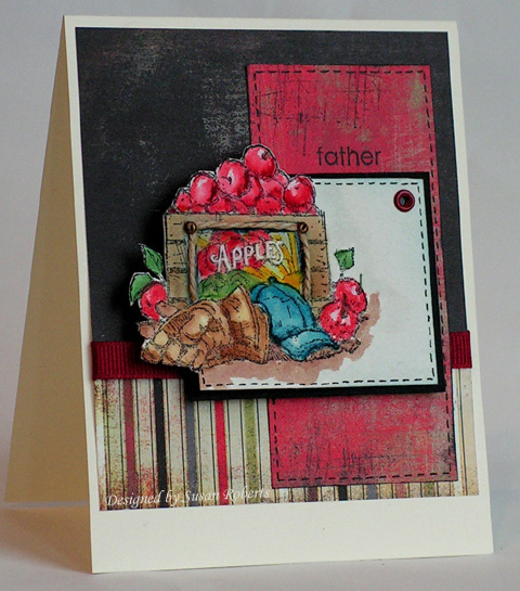
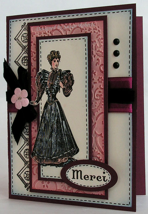
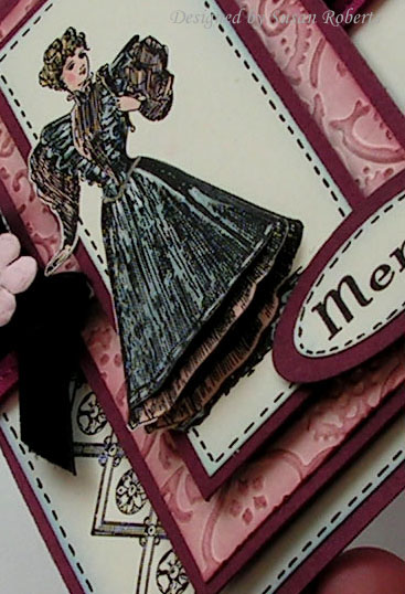
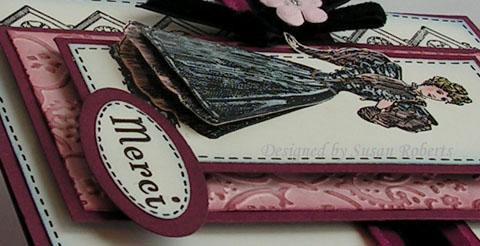
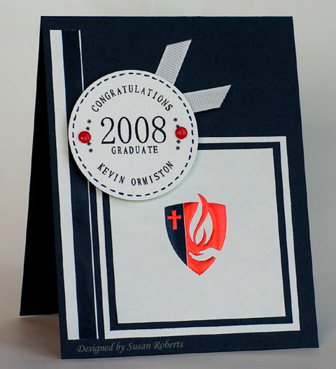
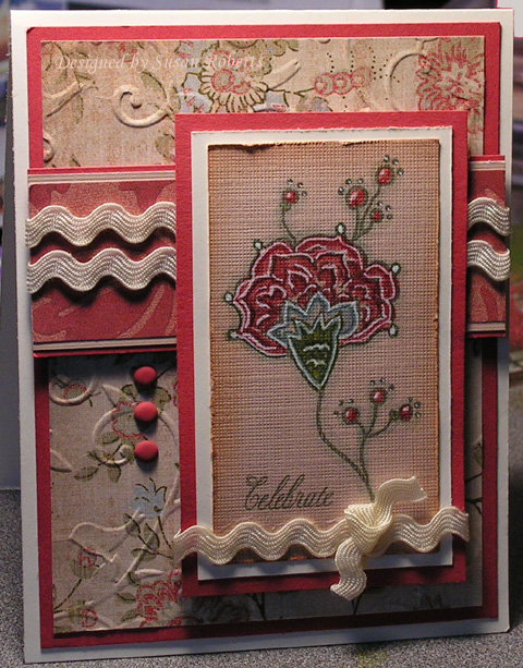
This first card is for my DFIL. The image is colored with SU! reinkers. The designer paper is from Basic Grey’s “Scarlet’s Letter” .

Stamps: SU! “For Father”, “Sanded”, “Wonderful Favorites”
Papers: Watercolor, Very Vanilla, DP Basic Grey’s “Scarlet’s Letter”
Inks: Jet Black Stazon, SU! Reinkers in Ruby Red, Certainly Celery, Garden Green, Summer Sun, More Mustard, Creamy Caramel, Close to Cocoa, Not Quite Navy
Accessories: GG Ribbon, Eyelet, Miniature Screw Brads, Twine, Gel Pens

blog67b1withwm.jpg

blog67b2withwm.jpg

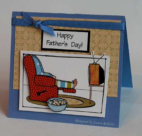
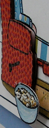
This card is for my DH. He looks pretty comfy there in his chair. And I’m so proud that he color coordinated his evening wear. He won’t get this card until he gets back from his trip. His two sons living here can give him a second special day. Hope the popcorn is still good by then. *chuckle* It was made with Liquid Applique. After using my heat gun to puff it up, I took a Summer Sun marker and colored around it. More LA would have helped to cover the stamped black lines, but I had to laugh. I can never pop a bag of microwave popcorn without burning some of it! So in reality this is pretty much what our popcorn looks like around here! I had so much fun with all the paper piecing on this one. Lots of dimension, too. The TV antena is colored with Sakura’s StarDust GellyRoll Pen and the TV screen is colored with their Glaze Gray Pen.

Next time I use this image, I will lay down some “carpet” and put up some wallpaper first and then stamp and paper piece on top of that. With the white walls and floor, DH almost looks like he is sitting in the dentist’s chair. Which brings us to card #3…

Stamps: MFT “Let’s Hear it for the Boys”
Papers
: PTI White, Brocade Blue, Basic Black, DP..Lots!
Inks: Jet Black Stazon, Brocade Blue, Creamy Caramel, Blush Blossom
Accessories: GG Ribbon, Sakura’s StarDust GellyRoll Pen, Glaze Pen, Gel Pen

blog67dwithwm.jpg
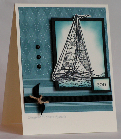
This card is for my DS Jeff, who is in dental school and who has just informed DH and me that we are going to be grandparents again come January! This will be Jeff and Kimberly’s first. So I thought I would get him started with his first Father’s Day card. Kimberly is my DDIL whose cards I have shared both here and over in my SCS Gallery. Actually Jeff has made me a card or two as well that I have also uploaded there.

All stamps, papers, inks and accessories are from Stampin’ Up! which makes this an SUO card. (Well except for that little piece of twine. I think I raided DH’s tool box some time ago and stole away with his ball of twine. Wonder if he ever missed it.)

Stamps: SU! “Winds of Grace”, “Wonderful Favorites”
Papers: Very Vanilla, Basic Black, SU! DP “Prints” in Blue Bayou
Inks: Jet Black Stazon, Not Quite Navy
Accessories: GG Ribbon, Brads, Twine

blog67cwithwm.jpg

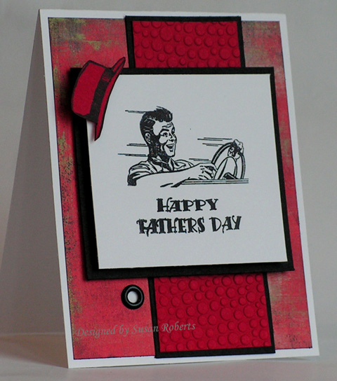
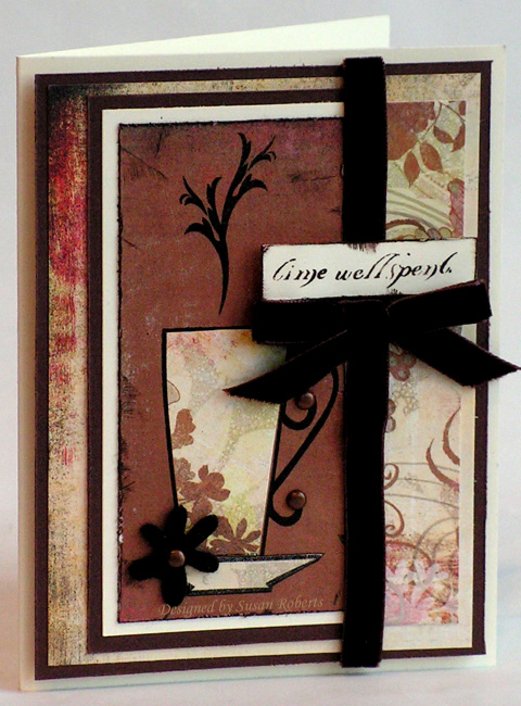
This card is for my DS Gary. He is the daddy to my sweet little twin granddaughters. The inside of the card reads, “Hats Off To You”. Parenthood came at a very young age for both him and his wonderful wife, Jenna.. just 19!! It was not easy.. the girls were very premature and when they were finally allowed to come home from the hospital they still had to have oxygen (as in tanks!) connected to them. Gary and Jenna were truly baptized by fire with these little ones and we are so proud of the great parents that they are. I love this image for Gary! It is so him… full speed ahead on life!

Stamps: Crafty Secrets Clear Art Stamps “Favorite Fellas”
Papers: PTI White, Basic Black, Real Red, DP Basic Grey’s “Scarlet’s Letter”
Inks: Jet Black Stazon
Accessories: Cuttlebug, Embossing Folder “Bubbles”, Jumbo Eyelet

For a couple of months I have wanted to use this scripture for the Bible Verse Challenge at Splitcoaststampers. So I have been looking for a Lily of the Valley floral image. Imagine my delight when I saw Flourishes‘ just released “Peony” set with just that!

blog66withwm.jpg

I used the sweet little Lily image and stamped it with one of the designs from the “Flourished Elements” set. The Lilies were colored with LuminArte’s Twinkling H2O’s in Siam White. (I wish that I could have gotten the picture to show the shimmer on these delicate little flowers.) The bee and the flower’s name stamps are also from the “Peony” set. The scripture was computer generated.

Recipe is for the card only. A tutorial for the box with the hooks for hanging each month’s card can be found here.

Stamps: Flourishes: “Peony” and “Flourished Elements”
Papers: So Saffron, Always Artichoke, Bashful Blue, Whisper White, SU! DP “Le Jardin”
Inks: Always Artichoke and Markers: Always Artichoke, Barely Banana and More Mustard
Accessories: Jumbo Eyelets (Pewter), Sakura Pens: White Gel and Stardust (bee’s wings), Organdy Ribbon, Pearl, Computer/Printer, LuminArte Twinkling H2O’s

Flourishes new “Stamp Simply” line is here! This first set released today is called “Coffee With Friends”. Below are a couple of cards made with it. Both are paper pieced. And let me tell you if you love paper piecing, then this is a MUST HAVE set!! It is perfect for it!

blog65awithwm.jpg

This first card truly lives up to the “Stamp Simply” goal. The stack of cups image was stamped on four different Basic Grey designer papers from their “Two Scoops” 6X6 pad and then pieced. And see that embossing on the back panel? That was achieved by running the card stock through the Cuttlebug using the Swiss Dots embossing folder. To get both a negative and positive embossing I ran the card stock through once, flipped it and ran it through the Cuttlebug a second time. I thought it was kinda fun. I used my scoring tool to score the lines around the main image and along the scalloped edge. I added some ribbon and bling and it was done!

blog65bwithwm.jpg

On this second card I pieced again. (Did I mention how perfect this set is for it?) This time I used Basic Grey’s “Scarlet’s Letter” designer paper. With all this scrumptious paper it doesn’t take much more to complete the card. With just a few brads, velvet ribbon and a felt flower, it’s done.

Just Because:
Stamps: Stamp Simply “Coffee With Friends”, Sentiment “Siberian Iris”
Papers: PTI White, Basic Black, DP Basic Grey “Two Scoops”
Inks: Jet Black Stazon
Accessories: Rhinestone Brads, Ribbon, Scalloped Scissors, Cuttlebug, Swiss Dots Embossing Folder, Fiskar’s Scoring Tool, Sakura “Stardust” Pen

Time Well Spent:
Stamps: Stamp Simply “Coffee With Friends”
Papers: Very Vanilla, Chocolate Chip, DP Basic Grey “Scarlet’s Letter” and “Two Scoops”
Inks: Jet Black Stazon, Timber Brown Stazon, Chocolate Chip Marker
Accessories: Brads, Velvet Ribbon, Felt Fusion Flower

blog64bwithwm.jpg

Yes, I know, it’s June. I had fallen behind on the Splitcoaststampers Christmas Card Challenge to make 10 Christmas Cards each month. But with these I have caught up!

There is one thing though… the sentiment. It always seems to be the hardest part of making the card. I still haven’t decided where I like it best or if no sentiment at all is my favorite. What do you think?

blog64cwithwm.jpg

The ornaments are colored with Sakura Glaze gel pens. They are also embossed using the Swiss Dots embossing folder for my Cuttlebug.

Stamps: DeNami Design, SU! Peaceful Wishes, Memory Box Sentiment
Papers: Certainly Celery, Handsome Hunter, Rose Red, Whisper White, DP Paper Pizazz “Holly on Green”
Inks: Handsome Hunter, Craft White, Marker Certainly Celery
Accessories: Sakura Pens: White Gel, Stardust, Glaze Red and Glaze Green, Striped GG Ribbon, Gold Cording, Snowflake Eyelets, Brads, Scalloped Punch, Corner Punch, Cuttlebug, Swiss Dots Embossing Folder

© COPYRIGHT © and FTC Declaration

All content on my blog is COPYRIGHT © 2008-2024 Susan Roberts. Please don't copy any of my stuff for publication, design or contest submission. I declare that I sometimes promote and/or endorse products that I currently receive or have received either for free or at a discount. That said, I won't ever recommend anything that I don't personally enjoy using or feel is a quality product.
© 2020 Rainy Day Creations Suffusion theme by Sayontan Sinha